

How to Create a Whole Home Color Scheme Like a Designer

Ever wonder why some homes just feel like they were designed by a pro? The secret almost always comes down to one thing: a whole home color scheme. When your home has a consistent, intentional palette, every room flows into the next—even if each space has its own personality.
Once your base color scheme is in place, it makes all the other design decisions—tile, paint, furniture, even throw pillows—so much easier. You’re not starting from scratch every time. You have a foundation to build on, which brings clarity and consistency to your home.
In this post, I’m sharing the same tips and tricks I use when creating color schemes for my design clients—so you can create one in your own home, just like a designer would.
Why a Whole Home Color Scheme Matters:
Creating the perfect color scheme for your home isn’t about making every room match, it’s about creating harmony throughout your space. When you repeat colors thoughtfully or even just stay within the same color families from room to room, your home will feel more intentional and connected. It’s the difference between a house that flows and one that feels a little disjointed - like every room belongs to a different house.
A well-thought-out palette brings a sense of calm and consistency to a home, even when each space has its own personality (which is the goal). It gives your home a common language that makes all the other design decisions—tile, furnishings, hardware, art—easier and more intuitive.
Having a color scheme for your entire home also helps prevent decision fatigue. When your colors are already working together, you’re not starting from zero with every new space. You’re just layering onto something that already makes sense. Think of it like a capsule wardrobe but for your house.
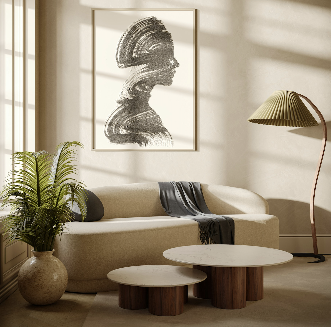
A neutral color scheme doesn’t have to be boring, starting with neutrals is the best way to start with a cohesive base and build on top of it.
Start with a Core Neutral:
Before going all in with color, I recommend starting with one core neutral (like white, greige, or soft taupe) to use throughout your home. If you’ve just purchased a new home—or you’re beginning a larger renovation—choosing one neutral wall color to start with is an easy way to create visual consistency instantly while you figure out the rest later. You can always add accent walls or bolder moments as your design evolves.
Unless you’re very confident in committing to a bold color throughout, this neutral color will act as a base that ties all of your rooms together. Most of the time, it’s your main wall color, but it could also be your trim and cabinetry.
When choosing a neutral, take into account your fixed finishes—things like flooring, cabinetry, and countertops:
• If your home has warm finishes (like honey oak floors or cream-toned tile), lean into a warm neutral to complement them.
• If your finishes are cooler (think whitewashed wood or blue cabinetry), go for a cooler neutral to keep everything cohesive.
Need help picking the right white? Here’s a roundup of my favorite white paint colors.
And if you’re working with a variety of wood tones, this post will help you mix them like a designer.
Build Your Palette with 3-5 Complementary Colors
Once you’ve landed on your core neutral, it’s time to build out your full-color palette. I recommend choosing no more than five total colors—including your neutral and any accent colors. This gives you enough variety to make each room feel unique, but still keeps the overall look cohesive.
Choose colors that work well with your neutral and with each other. A good palette includes a mix of:
Light and dark tones for contrast
Accent colors to bring in personality
Either warm or cool undertones, depending on your home’s base
If you’re new to this, I suggest sticking with either a warm or a cool palette rather than mixing the two. For example, if you’re working with a warm neutral on the walls, you’ll likely want warm-toned accent colors like clay, rust, ochre, or olive.
You don’t need to use all five colors in every single room. The key is to spread them out intentionally. One room might highlight your deeper tone with a dramatic wall color, while another uses a lighter shade as an accent in textiles or art. It’s more about repeating tones throughout the house in different ways so the palette feels connected without being repetitive.

Accent walls are a great way to bring in darker tones from your color story, be sure to repeat these colors in other rooms through textiles, art, furniture, or millwork.
Repeat Colors to Create Flow
One of the easiest ways to make your color scheme feel intentional is through repetition. When colors show up more than once—across different rooms and in different ways—they help the space feel cohesive without being boring.
That doesn’t mean painting every wall the same color. Think of it like this: a color you use on the walls in one room could reappear as an accent in decor, cabinetry, furniture, or even artwork in another.
You can repeat color through:
Throw pillows, curtains, or rugs
Painted furniture or built-ins
Accent tile or art pieces
Bedding, accessories, or even floral arrangements
Repetition is what ties your color palette together and makes it feel like a single story told throughout your home. When done well, it feels natural—not forced.
Always Test Before You Commit
Even with the best color palette, you still need to test your paint colors in your actual space. Lighting, room size, and surrounding materials can all affect how a color reads—and a shade that looks perfect in one room might feel totally off in another.
Paint swatches on the wall (not just the tiny ones from the store), and make sure to look at them during different times of day. Natural light changes throughout the day, and so will the way your colors appear.
If you’re testing multiple options, place them side by side and see how they interact with your floors, furniture, and other fixed finishes. It might feel like a small step, but it can save you from choosing a color that just doesn’t work once it’s up on the wall.
Creating a whole home color scheme is one of the best ways to make your space feel pulled together and professionally designed. With just a little planning upfront, you can create a palette that flows naturally from room to room, simplifies your design decisions, and reflects your personal style.
If you’re stuck trying to figure out where to start—or just want a second set of eyes to make sure it all works together—I’d love to help. Book a complimentary project planning call and we can chat about your space, your style, and how to bring it all together.
YOU MIGHT ALSO LIKE…


